Thursday, 31 January 2013

Digital print motif development

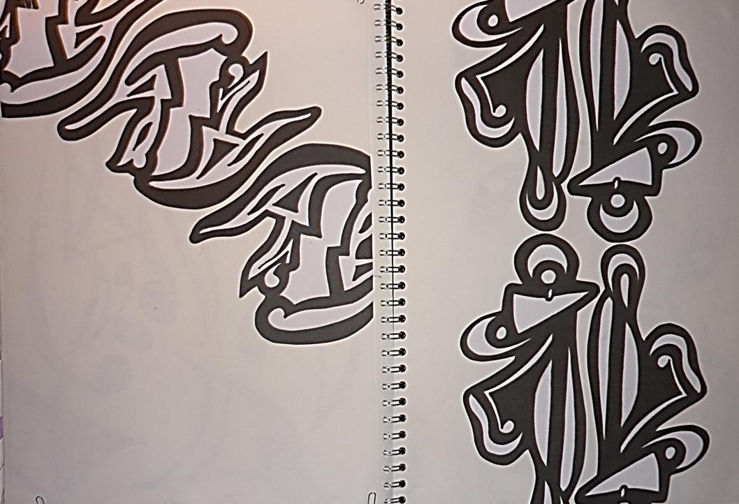
Before starting to develop digital prints, I had to produce new motifs that would then be made into brushes on photoshop. It was important to make sure that these new motifs were different from the others used for my screen. Sticking with black media, I started to look at some designs that I looked at right at the beginning of the project. I used fine liner, watercolour, oil bars and Biro.

 
   I thought that it would be a good idea to use smooth mark making as my motifs on screen were quite solid and graphical. This meant that my digital prints had a different feel to them, yet were still clearly part of the same collection.
   Once I had chosen the motifs to take forward into photoshop, I scanned them in, making sure it was on a high resolution to get all the detail. As a class, we had a digital work shop with our tutor, where we were taught how to make our motifs into brushes in photoshop. It was quite a easy process, so I picked it up quite quickly and finished all my brushes. We also had to put our colour palette onto the swatch palette on photoshop. We did this by eye, saved it and started to play with designs.
 
Creating my colour palette
 

(Intial colour palettes)
 
 
(Final colour palette)
 
 
I really liked my researched image therefore I decided to take my colours from that. Once my palette was developed I created my swatches on photoshop and started to create print designs. 

Thursday, 24 January 2013

Creating motifs to put onto screen

I didn't want to just copy existing material, therefore, I decided to take my own images to respond to (with a little help from my sister...again!!) My younger sister is a very talented dancer, so I thought it would be a good idea to take shots of her dancing! My idea was to focus on one part of her body; for example her hand. Looking at her hand I would then draw the shapes created from the movements. Once getting into it, I then used different parts of her body, even the general  movement of her whole body. It definitely wasn't as precise as the Bourett steps,and you couldn't tell what steps were made, however it got the mood and theme across well. I used different medias to draw with:pen, pencil and felt-tip pen. I found this helpful as I could experiment with the tone, texture and thickness of the motifs. 
 
 
Even though my designs are so different from my research, I have still taken some aspects of the original shapes. I really enjoyed producing these motifs; I found it interesting developing the shapes and seeing what they could look like as a print. My next task was to develop motifs to put on acetate so it could be exposed onto a screen for printing. I realised that I should create some more hand motifs that were different and a couple of digital motifs. This would mean that I had a variety of shapes to play with in the print room.
 
Motifs for screen printing


As well as having the motifs as a whole, I have also included them as separate shapes. This means that if I wanted to use a certain part of it to print, I could. I will be able to produce more of a range of prints and I won't get bored of only having a few motifs to use.

Monday, 10 December 2012

Print- The initial steps

   To start the project the tutors incorporated a team building activity (Chinese whispers) in which our brief was introduced. We were then encouraged to go to the library in order to independently explore the theme, 'data'. We could gather statistical data that included numbers,graphs,charts, bar and colour codes, and written analysis. But how could I use this data creatively?  
   At first I wasn't very inspired by the data that I had gathered as in my mind I see numbers and charts as boring pieces of information that cant be represented in a aesthetically and creative medium. I therefore decided to find data that I could relate to; for example, see a motif within the image. I also found coloured images as I thought it would inspire and encourage me to respond to the visual research collected.


When I first saw this image, I instantly thought of ladders. This helped with my drawing development as I didn't just think of statistics. One of the first activities was to create 3-4 rules to use when drawing. Mine were: draw with something unusual, use my left hand and three up and four across. This went against everything I would usually do, therefore created different responses. I then moved on to work in my sketchbook. I started working from the pie charts I had collected.


I found a book full of different types of graphs, statistics and images. This book appealed to me more than any other I had looked at as it included colour. As daft as it may sound, I was drawn to this as it made it nicer to look at! The book not only included pie charts from which I responded to but diagram of chains of molecules. I started to draw them, however I found my images just looked quite boring. I therefore decided to take shapes from the drawings and create motifs.


I really liked the motifs I developed, however I knew I couldn't just explore one thing so I moved on to explore more ideas. I came across a graph. It wasn't a really inspirational graph, nevertheless the colour caught my eye. I then started taking aspects of the image to create different motifs.


After working with circles, I decided to work on graph paper as I wanted some interesting outcomes. I found it quite good working on the paper as I had never done it before and it meant that every shape was pretty accurate. Once getting the designs I started working into them with watercolour. It had a completely different effect; it looked soft and textured instead of a block line/colour.
 
I liked the shapes created when the lines overlapped. It looked busy and geometrical, so I thought I could focus on those shapes and see what they could create.
 
Even though I was enjoying the work I was doing, I still wanted to explore more of the theme. I was interested in the idea of looking at data collected from movement. This would mean that more fluid and smooth shapes would be created.


 I found this image on the internet of bouree steps. This is how they used to record steps for ballet. I thought the shapes were really interesting as it was nothing I had seen before. The motifs included both straight and fluid lines. I started to copy these motifs to see how they were done and how I could interpret them.


Saturday, 1 December 2012

Evaluation of Origins Unit

    I think I have developed my work quite well within this project; you can see my journey from the start through to the end. From my research I worked with the ideas behind the images or source, developing motifs and experimenting with different designs. Nevertheless, I think I could have collected more of a variety of research, for example, looking more at designers work. Even though I did a bit of this, collecting more of this research could have inspired me even more, therefore producing more work and designs.


   I found it relatively easy to edit and select ideas to develop my work further. It was a natural process as I just went with what I preferred and what I thought would look good on garments. Once these ideas were chosen I developed motifs, always thinking about colours and pattern placements.
 
I also found my research from the shop report really useful. I could look at the work of other designers and see how they had used their patterns and placed them on the garments. Peter Pilotto’s work was very inspiring; he used bold, all-over digital prints on a lot of his collection, adding metallic textured panels. Every detail was perfect and even though you would think that floral, feather prints placed on padded jackets with metallic detail would be far too overpowering, it wasn’t. It made me realise that there are no restrictions. This project has forced the fact there is no point in being precious. If you think too much about what you’re doing and worry about your work no being perfect, then you’re just limiting yourself to how much work you produce. The amount of work doesn’t always matter, however, the less initial work you have means less development.

   I have always been good with time management and making sure I am organised. My organisational skills haven’t let me down during this project; nevertheless, I think I need to focus more on time management. I should work more in the studio as this will help me produce more work and I will get more inspiration from the people and things around me. If I come back to this specialism, I would really like to work on my fashion illustrations. Initially, I found it difficult to get my style, but with more work I feel I could really get into it. 
 
 I am happy with the work I have produced within TD4F, yet I know I could have done better overall. At the start of the project I wasn’t very inspired and I think this let me down as it took me a while to get into the project and start producing work that drove me to do more. Eventually I found what really interested me and from then on I enjoyed doing my work and I think I produced a lot of good ideas. Next time I need to just get stuck in and if I hit a block and don’t feel inspired, I need to do something about it. Every artist gets stuck but I need to learn to not hold back and go for it!  

Tuesday, 13 November 2012

Final Boards


I have really enjoyed this project as I have been able to explore my own ideas and go in whichever direction I wanted. My concept is surface design-looking at magnified images of interesting objects and texture. I really like my concept; it has emerged in my designs and I have made it my own. My colour palette is clear and strong and I would like to think that the customer profile I have chosen would like the designs too. When doing the shop reports, I looked in Selfridges.  Stella McCartney, Peter Pilotto and Alexander Mqueen had there garments consisting of bold, textured prints. Each designer added something different to them; McCartney embroidered on top of the heavy prints, Pilottos prints consisted of floral and feather designs, creating texture while also adding metallic and  Mqueen used repeat patterns of wildlife to create depth and texture. Designers such as Vivienne Westwood and Victoria Beckham used bodycon dresses; they were simple however the way in which they were made, created beautiful feminine silhouettes.
(Peter Pilotto)
 
I was inspired by doing the shop report and realised that I wanted to do bold, vibrant prints on garments such as bodycon dresses and blouses. I collected many inspirational images; some were my own photographs and others were found on blogs, books and the internet. I then started working on the idea of magnified surface design.


I found an amazing blog by Leandra Medine: www.manrepeller.com. She is in her late 20's early 30's and is so quirky.  She is exactly the sort of person I would like to show off my designs. Leandra wears bold prints and quirky cuts; ideal for my collection. Being smart casual; the garments are ideal for work; smart but comfortable. My favourite designs are the prints with the abstract painterly backgrounds and the overlapped line motif, as seen on the trousers. The painterly designs add texture and depth whilst the motifs on top add character and style. 


At the start of this unit, I found producing flats really difficult; "Illustrator" did not agree with me! Nevertheless, after a bit of work and a good play, I found it really enjoyable. I think my flats are drawn very accurately and they would work well with the designs.

Monday, 12 November 2012

Origins

The importance of Research
To kick start the project we started to work in groups to collect ideas for a new theme. We then had to produce a research board showing all of the items found. The board had to include 3D objects, inspirational images, fabric swatches and anything that we found interesting and that linked with the theme. I personally found that the images I collected were very useful; they were either my own work or pictures I found on a blog. However the task wasn't completed as best as it could have been; we didn't meet to create our board as a group therefore not everything linked. Some people collected magazine cut outs and this, in my view,  isn't always the best research. Images found in magazines have already been inspired; the designer has taken inspiration from something or someone to create that garment. However an image of something like a flower or a burst of colour can inspire .
 
Looking at my drawings I realised I wanted to concentrate on surface design. I enjoyed drawing close-ups of fruit and vegetables  as I could focus on the patterns within them. I then decided to look at skin cells concentrating on their shapes and colours .


After having a brief look at skin cells, I realised that I had to make my theme more targeted. Focusing on just skin cells would restrict my work as the shapes are quite simple and would become really repetitive.So I decided to look at surface designs in general focusing on close-ups; magnified surface design.


I collected a variety of fruit and vegetables to draw. I found the exotic, pink mushrooms really interesting to respond to. I like the shapes and lines within the mushrooms . I  used paint very freely to create the abstract images which  I saw. I also really liked the colour palette running throughout therefore I carried on using it


As texture is such a major part of surface design I thought it would be a good idea to explore it further. I responded to it abstractly and in detail. I used the same colour theme and made sure I worked freely, exploring every aspect.

Developing Motifs

I really liked looking at the fruit and vegetables as the shapes within them were so natural and fluid. I decided to take the colours from the cabbage and use them as my colour palette. I used fine liner and watercolour to develop motif ideas and found a pattern I really liked and that I felt would work on a garment.


I love developing motifs from a simple idea; a simple inspirational image or object becoming an interesting motif that can be placed on a garment. I really liked looking at the fruit and veg as the shape within them are so natural and fluid. I decided to take the colours from the cabbage and use them as my colour palette. I used fine liner and watercolour to develop motif ideas and found a pattern I really liked and would work on a garment.


I particularly found the passion fruit  interesting to respond to. Even though it just consisted of ovals and seemed  less inspiring , I found the arrangement of them and the pattern made quite alluring. I really liked my drawing from the initial image and therefore started to work on the colours and the shapes. I scanned my work into the computer and played with the colours and how magnified it was. Depending on the image, magnifying the image too much ruins the mood of it, nevertheless with some images, the more abstract it is the better. I placed my work onto an illustration and realised the potential of using abstract painterly designs in my collection.

Looking at placement of print designs
I thought quite hard about the placements of my designs; it needed to be clear that all of designs were part of a collection yet the motifs etc couldnt be the same on each garment. This was quite difficult in some ways as I naturally play around with one design but in different colours, placements and sizes. Looking at these qualities is really interesting, but I had to do this will a different motif and design. It's interesting how the size of a motif can give a different feel to a grament even though it is exactly the same design. For example a flower; a tiny daisy repeated all over a dress, this gives a very girly feel, however a very large daisy  on a dark background gives a quirky feel. Prada's Spring 2013 Ready-to-wear collection is a great example for the play of placement on garments.

 
This is a review of this collection by Nicole Phelps:

"Dream is forbidden, nostalgia is forbidden, to be too sweet is not good.The clothes are the expression of this impossible dream." The flowers, the pervasive Japonisme—here we had Prada embracing traditional tropes of femininity and womanhood, a geisha's servitude, even. And yet in her signature way, she couldn't help turning those notions inside out.

She opened with a short black dress in stiff satin, a panel print of two flowers stitched to the torso. There were only a handful of looks that followed that didn't have some sort of florals blooming on them: A white fur coat (for Spring!) was inset with Andy Warhol's Pop art daisies in red (adding to the sixties feeling was the collection's whiff of Courrèges). A black satin coat, meanwhile, was embroidered with papery origami blossoms. Still, the clothes had a spareness that worked like a balm after seasons of endless prints.

The collection moved from dark to light. By the end, Prada was manipulating, folding, and wrapping duchesse satin in palest pink and green to evoke the ritual of kimono dressing. (Both the runway and the columns in the show space were decadently lined with that satin.) Prada explained that the Japanese element came late in the design process. "I wanted it to be tough and serious," she said. "All the folding was a consequence." Duchesse satin tough? Again there was that duality.

There was poetry to these clothes, but walking the runway in either towering Harajuku girl platforms or leather judo socks bound with patent leather bows—flats in both cases, Prada pointed out—the models exuded power too. Leave it to Miuccia to tweak nostalgia into something that felt modern and new.


I really enjoyed producing illustrations. At first I found it quite hard to establish my own style but after experimenting and working with different ideas I found my path. I realised that quite a few of my designs are made with fluid lines therefore I thought it would work if my illustrations were too. My illustrations are simple, however work quite well as it sticks with the style of my designs I tried my best to make them my own and I feel I have succeeded.

Sunday, 30 September 2012

The art of Editing and Selecting for 'Drawing'

On Friday, I had to look at the drawings and items I had collected from my trip to Liverpool and edit them making a collection of similar drawings, marks and colours that have inspired me. In Liverpool I loved a piece of artwork from the Tate gallery; the shapes and curves were so flowing. Looking at the drawing I had done on the day with pastels, I knew I wanted to look at this more in depth. I started to repeat the shapes from the piece just using pencil and I liked the how it was starting to come together.
 
Looking at this sketch, I wanted to make it into a successful pattern. I therefore made big abstract strokes  using fine liner. I worked with the size and the layout of the shapes. I added colour; blues and greens to link with the idea of water, as it was raining all day on our journey to Liverpool.


I then started working on my final piece of the day. I decided to go with the bigger format, so I started to work with the pattern across the middle of the page, spreading over to the right. I used watercolour and biro pen to outline the shapes. After talking to a tutor and looking over the brief of the day, I realised that I hadn’t collected a range or sketches from the day out; instead I just used one idea. Realising this, I then looked through my sketchbook to look for motifs of items that could be used with the existing pattern. I remembered that the shape of the building of the Liverpool museum was really interesting. The smooth shapes juxtaposed against the harsh shapes of the building.  Using the space on the left hand side of the page I spread the shapes from the museum and writing from leaflets.
 
The final piece isn’t exactly how I would have liked it however for a days work, I think it is quite good. Next time I will look at the brief more thoroughly and assess what I should do before getting excited with an idea and just going for it.