In Paris, I found the metro very inspirational (strange I know). All of the hustle and bustle, the different types of people, different languages and the garish colours on the train stood out to me. We stopped off at the metro stop next to the Eiffel Tower. When getting off the metro; following the tunnels and the crowd of people to the opening, I caught a glimce of shapes, people and lines, so I had to stop and take a picture.
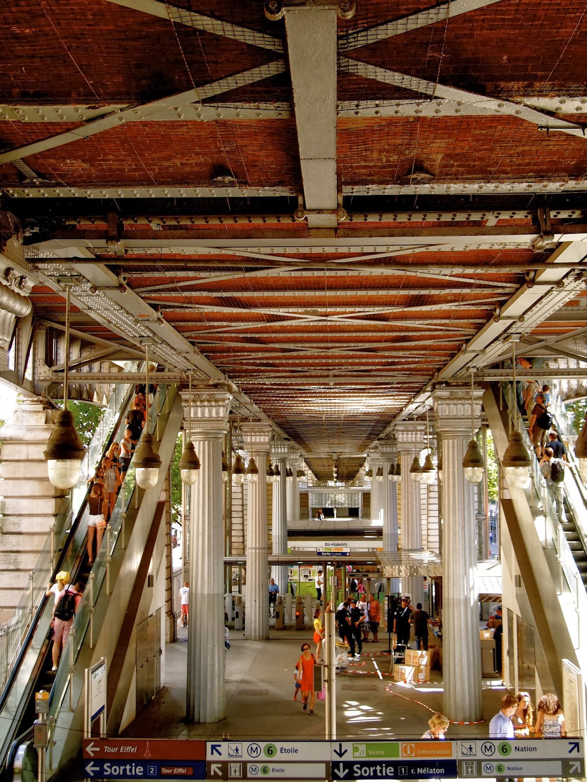
I know some would think this photo is nothing special as it’s just a busy metro station, however I would totally disagree. The lines of the ceiling looked elegant to me, with the lights hanging down in a certain pattern, weaving in and out of the pillars holding the structure up, and the escalators positioned perfectly either side. The station probably looked it’s best from this spot, and I had to capture it.
This image stood out for me when creating design ideas; I wanted to see how I could respond to the flow of the lines. I started to create simple sketches from looking at the image; the idea was to keep the shapes simple, as this is what made them so beautiful, additionally I wanted to work with them within Photoshop, to create a structured print.


After responding to the image this way, I
then scanned the sketches into my mac and started to create brushes from what I
thought would work effectively. I love being able to create my own brushes on
Photoshop as it means that I can work with them in whatever way I want; creating a
pattern with something that’s my own. Photoshop gives you the flexibility to be
able to transform and create shapes, that you wouldn’t usually be able
to do on paper alone. Additionally you can easily drop in the colours that are part of your
desired colour palette; saving a colour swatch so your palette is always at
hand. I have done quite a bit of research on colours as initially I was scared
to bring colour into my work as I found black safe to create clear patterns
that could then be transferred onto my computer. At college I always used the magazine ‘Bloom’
as it was so inspiring; I could pick up colour palattes that stood out to me
while flicking through it. Nevertheless I sort of forgot about this brilliant
magazine until Teresa brought it up in a tutorial. After hearing this name again,
I headed straight to the library to find some inspirational images. I had in
mind what kind of mood I wanted to portray through my work, so this probably
made it easier when I approached the magazines.
At the start of my holidays I had seen an article about a designer
called Mary Katrantzou.
No comments:
Post a Comment