After looking at my summer work and the brief given, I decided to go with 'Urban Influences'. I have always been inspired by architecture; it has always stood out for me as it can be so striking. The ideas of how the building came into existence and why it was designed the way it was, is fascinating. My eye automatically looks for line within a scene; even in a normal situation, my eye catches interesting shapes that are created through the lines of a variety of objects. I always take in my surroundings wherever I am; I like to study people and their body language, the buildings around me, the atmosphere of where I am and what creates that, the smells, the colours and many other things. So to choose the concept 'Urban Influences' and be able to create work based on all of these factors is perfect for me. I enjoy photography, therefore one of the first things I am going to do it venture out and collect images. My summer work focuses on architecture in France therefore I have a base on which to start; I'm going to use images I have taken on holiday to kick start the project. Nevertheless, I can't forget I live in such a striking city; I might as well use it!
Thursday, 26 September 2013
Wednesday, 25 September 2013
Summer 2013- The inspiration of the image
In Paris, I found the metro very inspirational (strange I know). All of the hustle and bustle, the different types of people, different languages and the garish colours on the train stood out to me. We stopped off at the metro stop next to the Eiffel Tower. When getting off the metro; following the tunnels and the crowd of people to the opening, I caught a glimce of shapes, people and lines, so I had to stop and take a picture.
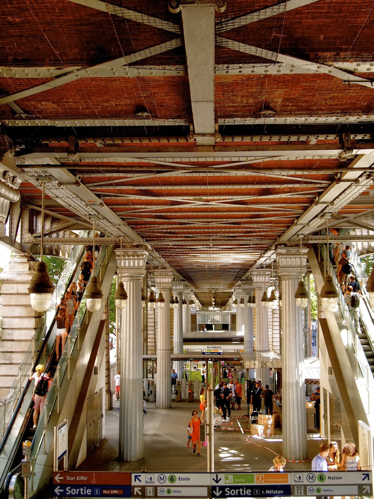
I know some would think this photo is nothing special as it’s just a busy metro station, however I would totally disagree. The lines of the ceiling looked elegant to me, with the lights hanging down in a certain pattern, weaving in and out of the pillars holding the structure up, and the escalators positioned perfectly either side. The station probably looked it’s best from this spot, and I had to capture it.
This image stood out for me when creating design ideas; I wanted to see how I could respond to the flow of the lines. I started to create simple sketches from looking at the image; the idea was to keep the shapes simple, as this is what made them so beautiful, additionally I wanted to work with them within Photoshop, to create a structured print.


After responding to the image this way, I
then scanned the sketches into my mac and started to create brushes from what I
thought would work effectively. I love being able to create my own brushes on
Photoshop as it means that I can work with them in whatever way I want; creating a
pattern with something that’s my own. Photoshop gives you the flexibility to be
able to transform and create shapes, that you wouldn’t usually be able
to do on paper alone. Additionally you can easily drop in the colours that are part of your
desired colour palette; saving a colour swatch so your palette is always at
hand. I have done quite a bit of research on colours as initially I was scared
to bring colour into my work as I found black safe to create clear patterns
that could then be transferred onto my computer. At college I always used the magazine ‘Bloom’
as it was so inspiring; I could pick up colour palattes that stood out to me
while flicking through it. Nevertheless I sort of forgot about this brilliant
magazine until Teresa brought it up in a tutorial. After hearing this name again,
I headed straight to the library to find some inspirational images. I had in
mind what kind of mood I wanted to portray through my work, so this probably
made it easier when I approached the magazines.
At the start of my holidays I had seen an article about a designer
called Mary Katrantzou.
Wednesday, 18 September 2013
Summer 2013- Inspiration and ideas
I have really enjoyed researching and
compiling a decent amount of work together over the summer. I was around some
really inspiration places therefore it made it quite easy for me to respond to
them. I have always been a keen photographer so I made sure that I captured
anything and everything I could. Over the holidays I visited France with my
family. We stopped outside of Paris for a couple of nights so it meant that we
could go in for a day. I found the architecture so beautiful; the bridges,
typical little French houses against some striking clean cut areas. I found the
‘lovers bridges’ so beautiful. Over the years people have visited from all
around the world and place a padlock on one of these bridges. It’s like
leaving a piece of you in Paris. Some do it just to say they’ve done it however
others so it with a loved one to feel closer and to make a memory. The metal from
the padlocks glistened in the sun, bouncing colour and beautiful overcrowded
shapes across the bridges.

When photographing these bridges I knew how
I could respond to them; I wanted to capture the different shapes and colours
in the way I drew them. I like drawing in quite an abstract way so it can create
interesting prints, however I made sure I didn’t just stick to this, therefore
I worked in different medias too. I also looked at the structure of the
bridges themselves instead of the locks; the way the elegant lines held up the
elegant structures. I love looking at what lines make up an image; when
designing a print, lines are key as they build an almost grid to build upon.


Using photoshop, I decided to create a interesting print from the work made using the images of the bridges. Changing the opacity of the brush meant that I could overlap the shapes to create a soft yet striking print. It reminded me a little of tartan with the layered lines and use of different colours.
Subscribe to:
Comments (Atom)